CLIENT: Mutual of omaha
AGENCY: CAMPBELL EWALD
Campbell Ewald reached out to me with a project from their client, Mutual of Omaha. They wanted to add an illustrated touch to some of the resources available on their website.
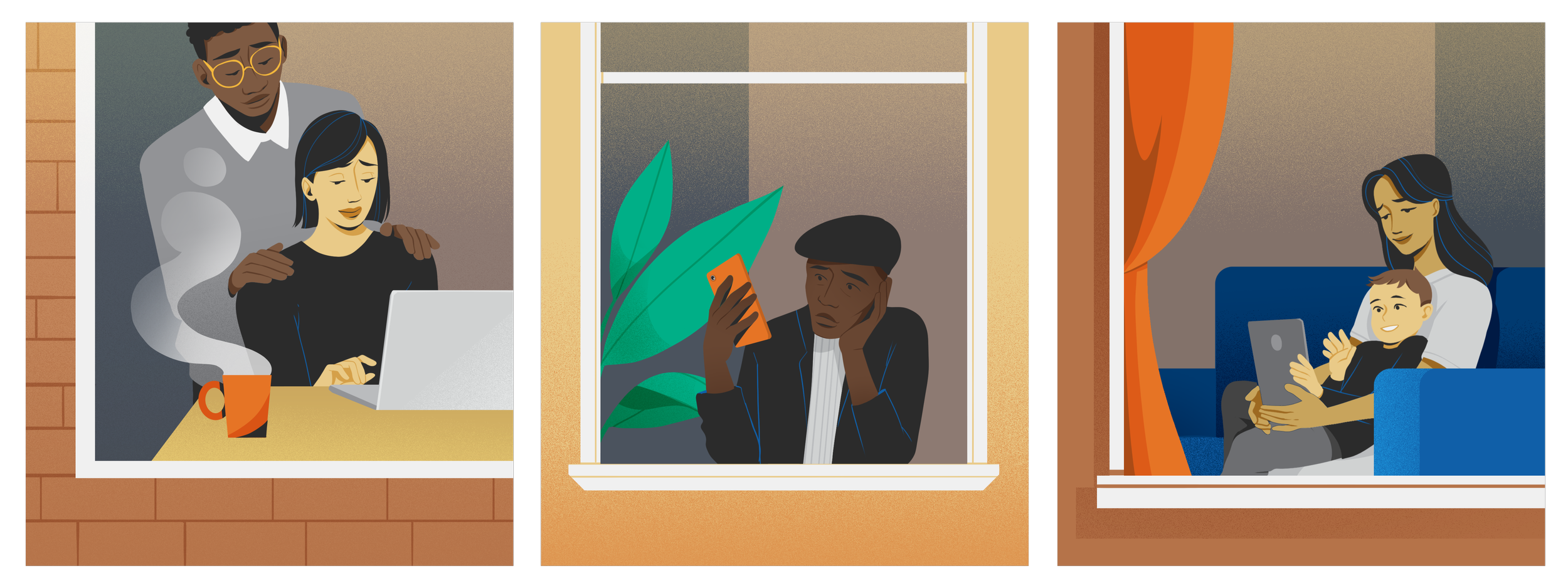
Their branding didn’t involve a lot of illustration, so I needed to come up with a style that felt warm and welcoming to those seeking answers to sensitive topics, but also grounded enough that it represented a credibility of an established insurance company.
I leaned heavily on Mutual of Omaha’s palette to pull through their branding, keeping things minimal by using blocks of solid color with subtle gradients for depth.
The project consisted of 3 different parts, each needing their own deliverables:
A Guide to Hospice Care
What hospice covers
The hospice team
A few last tips for those who want to die at home
How to Plan a Virtual Funeral
Virtual funeral services help us mourn as a community
Professional planners specializing in virtual funerals
Do it yourself
Decide on the key elements of your event.


